
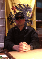
Watch newly released raw video of Darth_Aurelius reflections on the recent interview that he granted to the notorious YouTuber known as Slyboy
https://mensrights.space/forum/viewtopi ... 817#p24817
https://mensrights.space/forum/viewtopi ... 817#p24817
Is there a special logo for the IPF or is it the same logo as the IBM?
-
Darth_aurelius
- Captain

- Posts: 4402
- Joined: 07 May 2024, 18:17
-
IPF Service Award
Activity Award Medal
The logos are distinctive and they reflect the different missions of these two distinct but distinguished organizations. The logo of the IBM is featured on the top of the forums and consists of the paradigmatic/Platonic Incel man enwreathed in golden clasps of wheat which represent the power of the masses in their proletariat struggle against the jewish, foid and simp bourgeoisie. Since we honor the traditions of the Bolsheviks and seek to emulate their fight against the tyranny of aristocratic and pretentious Russian cunt princesses, we borrow heavily from the emblems of the Soviet state which itself was ruled by old, white veterans of the Great Patriotic War.
The Great Seal of the IPF is similar to that of the IBM but features crossed AK-47's which are the weapon used by freedom fighters everywhere from our black brothers in the Revolutionary United Front in Sierra Leon who fight to kill or enslave NPC normies, make child soldiers of their youth and rape all foids in sight to the mighty men of the Mujahedeen of ISIS. See below for the two emblems.
@Tovarishcel
IBM
IPF
Captain, Commanding Officer and Founding Father of the Incel Movement
-
IBG
- Posts: 63
- Joined: 02 Sep 2025, 13:26
-
Dishonor Award
-
Darth_aurelius
- Captain
- Posts: 4402
- Joined: 07 May 2024, 18:17
-
IPF Service Award
Activity Award Medal
IBG wrote: 08 Jan 2026, 14:15 Just my opinion, but I think the guy looks too dejected. It doesn't really imply strength or action.
If we get a bit larger, I would suggest a revision to something more lively.
No that is the whole point and the caricature of the incel man conveys the immiseration, dejection, frustration and rage which many of us endure and experience on a daily basis. It is also the coin of the realm and is a universally recognized symbol amongst our brethren.
Captain, Commanding Officer and Founding Father of the Incel Movement
-
Pour_Lui

- Soldier

- Posts: 325
- Joined: 13 Dec 2025, 11:42
-
IPF Service Award
Activity Award Medal
Darth_aurelius wrote: 08 Jan 2026, 14:10
The logos are distinctive and they reflect the different missions of these two distinct but distinguished organizations. The logo of the IBM is featured on the top of the forums and consists of the paradigmatic/Platonic Incel man enwreathed in golden clasps of wheat which represent the power of the masses in their proletariat struggle against the jewish, foid and simp bourgeoisie. Since we honor the traditions of the Bolsheviks and seek to emulate their fight against the tyranny of aristocratic and pretentious Russian cunt princesses, we borrow heavily from the emblems of the Soviet state which itself was ruled by old, white veterans of the Great Patriotic War.
The Great Seal of the IPF is similar to that of the IBM but features crossed AK-47's which are the weapon used by freedom fighters everywhere from our black brothers in the Revolutionary United Front in Sierra Leon who fight to kill or enslave NPC normies, make child soldiers of their youth and rape all foids in sight to the mighty men of the Mujahedeen of ISIS. See below for the two emblems.
@Tovarishcel
IBM
IBMlogo.jpg
IPF
IPFnewlogo.png
IBG wrote: 08 Jan 2026, 14:15 Just my opinion, but I think the guy looks too dejected. It doesn't really imply strength or action.
If we get a bit larger, I would suggest a revision to something more lively.
I agree with IBG, that the man in this logo looks a bit too depressed, to the point it implies weakness and lack of action. It might be more interesting if the focus turns into the blackpill and the weapons in the IPF logo. The IBM logo can remain the same, but we need something that implies revolt in the IPF one.
-
Darth_aurelius
- Captain
- Posts: 4402
- Joined: 07 May 2024, 18:17
-
IPF Service Award
Activity Award Medal
Pour_Lui wrote: 08 Jan 2026, 14:30Darth_aurelius wrote: 08 Jan 2026, 14:10
The logos are distinctive and they reflect the different missions of these two distinct but distinguished organizations. The logo of the IBM is featured on the top of the forums and consists of the paradigmatic/Platonic Incel man enwreathed in golden clasps of wheat which represent the power of the masses in their proletariat struggle against the jewish, foid and simp bourgeoisie. Since we honor the traditions of the Bolsheviks and seek to emulate their fight against the tyranny of aristocratic and pretentious Russian cunt princesses, we borrow heavily from the emblems of the Soviet state which itself was ruled by old, white veterans of the Great Patriotic War.
The Great Seal of the IPF is similar to that of the IBM but features crossed AK-47's which are the weapon used by freedom fighters everywhere from our black brothers in the Revolutionary United Front in Sierra Leon who fight to kill or enslave NPC normies, make child soldiers of their youth and rape all foids in sight to the mighty men of the Mujahedeen of ISIS. See below for the two emblems.
@Tovarishcel
IBM
IBMlogo.jpg
IPF
IPFnewlogo.pngIBG wrote: 08 Jan 2026, 14:15 Just my opinion, but I think the guy looks too dejected. It doesn't really imply strength or action.
If we get a bit larger, I would suggest a revision to something more lively.
I agree with IBG, that the man in this logo looks a bit too depressed, to the point it implies weakness and lack of action. It might be more interesting if the focus turns into the blackpill and the weapons in the IPF logo. The IBM logo can remain the same, but we need something that implies revolt in the IPF one.
We can engage in dialectics on this if you want to come on to element and talk to me personally but the decision has been made and patches have already been ordered for our uniforms. The dejected incel man in meant to symbolize the meek and downtrodden who are empowered (by way of AK-47's) to realize their manifest destiny and to liberate themselves from the oppression of the jews and foids.
Captain, Commanding Officer and Founding Father of the Incel Movement
-
Pour_Lui
- Soldier
- Posts: 325
- Joined: 13 Dec 2025, 11:42
-
IPF Service Award
Activity Award Medal
Darth_aurelius wrote: 08 Jan 2026, 14:34Pour_Lui wrote: 08 Jan 2026, 14:30Darth_aurelius wrote: 08 Jan 2026, 14:10
The logos are distinctive and they reflect the different missions of these two distinct but distinguished organizations. The logo of the IBM is featured on the top of the forums and consists of the paradigmatic/Platonic Incel man enwreathed in golden clasps of wheat which represent the power of the masses in their proletariat struggle against the jewish, foid and simp bourgeoisie. Since we honor the traditions of the Bolsheviks and seek to emulate their fight against the tyranny of aristocratic and pretentious Russian cunt princesses, we borrow heavily from the emblems of the Soviet state which itself was ruled by old, white veterans of the Great Patriotic War.
The Great Seal of the IPF is similar to that of the IBM but features crossed AK-47's which are the weapon used by freedom fighters everywhere from our black brothers in the Revolutionary United Front in Sierra Leon who fight to kill or enslave NPC normies, make child soldiers of their youth and rape all foids in sight to the mighty men of the Mujahedeen of ISIS. See below for the two emblems.
@Tovarishcel
IBM
IBMlogo.jpg
IPF
IPFnewlogo.pngIBG wrote: 08 Jan 2026, 14:15 Just my opinion, but I think the guy looks too dejected. It doesn't really imply strength or action.
If we get a bit larger, I would suggest a revision to something more lively.
I agree with IBG, that the man in this logo looks a bit too depressed, to the point it implies weakness and lack of action. It might be more interesting if the focus turns into the blackpill and the weapons in the IPF logo. The IBM logo can remain the same, but we need something that implies revolt in the IPF one.
We can engage in dialectics on this if you want to come on to element and talk to me personally but the decision has been made and patches have already been ordered for our uniforms. The dejected incel man in meant to symbolize the meek and downtrodden who are empowered (by way of AK-47's) to realize their manifest destiny and to liberate themselves from the oppression of the jews and foids.
If you already invested money into this then it's alright. I've asked this because I've been thinking about doing some funny posters.
Create an account or sign in to join the discussion
You need to be a member in order to post a reply
Create an account
Not a member? register to join our community
Members can start their own topics & subscribe to topics
It’s free and only takes a minute